
1. Introduction
Why Typography is More Than Just Fonts
Typography is the art and technique of arranging type to make written language legible, readable, and visually appealing. It goes beyond simply selecting fonts; it involves considering factors like font size, line spacing, kerning (the space between individual letters), and hierarchy. Effective typography creates a visual structure that guides the reader's eye and enhances the overall design.
First Impressions Start with Type
Just as a person's voice and tone can convey personality, typography sets the tone and conveys a message even before the words are read. It's often the first element a viewer notices, influencing their initial impression of a design, brand, or message. Well-chosen typography can establish credibility, evoke emotions, and capture attention.
2. The Psychology of Typography
How Fonts Affect Mood and Perception
Different fonts evoke different emotions and associations. For example, a classic serif font might convey tradition and trustworthiness, while a clean sans-serif font can feel modern and minimalist. These subconscious associations play a significant role in how a design is perceived.
The Role of Typography in Branding & Communication
Typography is a crucial element of brand identity. It helps to:
Reinforce Brand Personality: Fonts can reflect whether a brand is playful, sophisticated, rugged, or innovative.
Communicate Brand Values: Typography can convey a brand's core principles, such as tradition, modernity, or creativity.
Enhance Readability: Clear and legible typography ensures that the message is easily understood.
Create Visual Hierarchy: Effective typography guides the reader's eye and emphasizes important information.
3. Understanding Font Classifications
3.1 Serif Fonts
Characteristics: Serif fonts have small lines or strokes (called "serifs") at the ends of letters. They are often associated with tradition, elegance, formality, and trustworthiness.
Where to Use Them:
Editorials: Books, magazines, newspapers
Law Firms: Conveying authority and professionalism
Luxury Brands: Evoking sophistication and timelessness
Examples: Times New Roman, Georgia, Garamond, Baskerville
3.2 Sans-Serif Fonts
Characteristics: Sans-serif fonts lack serifs. They are typically perceived as clean, modern, minimalist, and approachable.
Where to Use Them:
Tech: Communicating innovation and efficiency
Startups: Projecting a contemporary and forward-thinking image
UI/UX Design: Ensuring readability on screens
Examples: Helvetica, Arial, Montserrat, Open Sans, Roboto
3.3 Script Fonts
Characteristics: Script fonts resemble handwriting, often conveying elegance, creativity, and a personal touch.
Where to Use Them:
Invitations: Adding a touch of formality and beauty
Fashion: Evoking style and sophistication
Personal Brands: Creating a unique and expressive identity
Examples: Pacifico, Great Vibes, Brush Script, Script MT, Lobster Two
3.4 Display/Decorative Fonts
Characteristics: Display fonts are designed to be eye-catching and expressive, often used for headlines, posters, and logos. They are typically bold, unique, and artistic.
Where to Use Them:
Headlines: Grabbing attention and creating impact
Posters: Conveying a strong visual message
Logos: Establishing a distinctive brand identity
Examples: Lobster, Bebas Neue, Impact, Playfair Display, Oswald
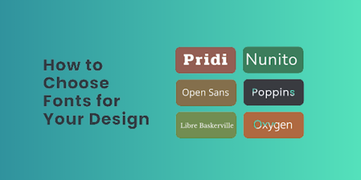
4. Choosing the Right Font for Your Design
Match Font Style with Brand Personality
The font you choose should reflect your brand's personality and values. For example, a playful brand might use a rounded sans-serif font, while a luxury brand might opt for an elegant serif font.
Consider the Medium: Print vs Digital vs Mobile
Different mediums have different requirements.
Print: Allows for more intricate and detailed fonts.
Digital: Requires fonts that are optimized for screen readability.
Mobile: Demands clear and legible fonts at smaller sizes.
Readability & Accessibility: Why Legibility Matters
Readability refers to how easily the text can be read in a block, while legibility refers to how easily individual letters can be distinguished. Prioritize fonts that are both readable and legible to ensure your message is effectively communicated to everyone, including those with visual impairments.
Tone of Voice:
Formal: Serif
Casual: Sans-Serif
Playful: Script or Display
5. How to Pair Fonts Like a Pro
Tips for Creating Visual Harmony
Font pairing involves combining two or more fonts in a way that is visually pleasing and effective. The goal is to create contrast while maintaining harmony.
Safe Pairing Rules (e.g., Serif + Sans-Serif)
A classic and reliable approach is to pair a serif font with a sans-serif font. This creates a clear visual distinction between headings and body text.
Tools for Font Pairing
Google Fonts Pairing Tool: Suggests font combinations available in Google Fonts.
Fontjoy: Uses AI to generate harmonious font pairings.
Adobe Fonts: Offers curated font pairings and recommendations.
6. Common Typography Mistakes to Avoid
Using Too Many Fonts
Using more than 2-3 fonts in a design can create a cluttered and confusing look.
Ignoring Line Spacing, Kerning & Hierarchy
Poor line spacing (leading), kerning, and lack of clear visual hierarchy can make text difficult to read and understand.
Choosing Style Over Function
Prioritize readability and legibility over purely decorative fonts, especially for body text.
Poor Contrast and Color Combinations
Ensure sufficient contrast between text and background colors to make the text easily readable.
7. Typography in Branding: Real-World Examples
Google: Uses a clean and simple sans-serif font (Product Sans) to project a modern and accessible image.
Vogue: Employs elegant, high-contrast serif fonts to convey sophistication and luxury.
Coca-Cola: Utilizes a distinctive script font that is instantly recognizable and conveys a sense of tradition and personality.
Spotify: Uses bold and modern sans-serif fonts to reflect its dynamic and innovative brand.
8. Free & Paid Resources for Great Fonts
Free:
Google Fonts: A vast library of free, open-source fonts.
DaFont: Offers a wide variety of free fonts, though quality varies.
Paid:
Adobe Fonts (formerly Typekit): A subscription service with high-quality fonts.
MyFonts: A large marketplace for premium fonts.
Fontspring
Tools:
Font Preview Tools: Allow you to see how a font looks in different sizes and contexts.
9. Conclusion
Final Thoughts: Type Wisely, Design Intentionally
Typography is a powerful design element that can significantly impact the effectiveness of your communication. Choose fonts wisely and design with intention to create visually compelling and impactful designs.
The Power of Typography in Storytelling & Branding
Typography can enhance storytelling, reinforce brand identity, and create a lasting impression on your audience. It's an essential tool for any designer or brand looking to communicate effectively and build a strong visual presence.
10. FAQs:
Q: Why is typography important in design?
Answer: Typography is crucial because it makes written language legible, readable, and visually appealing. It sets the tone, conveys a message, and influences a viewer's initial impression of a design or brand.
Q: What are the main font classifications, and how do they differ?
Answer: The main font classifications are:
Serif: Traditional, elegant (e.g., Times New Roman)
Sans-serif: Clean, modern (e.g., Helvetica)
Script: Elegant, handwritten (e.g., Pacifico)
Display/Decorative: Bold, unique (e.g., Lobster)
Q: How do I choose the right font for my design?
Answer: Consider your brand's personality, the medium (print, digital, mobile), readability, and the overall tone of voice you want to convey.
Q: What are some common typography mistakes to avoid?
Answer: Avoid using too many fonts, ignoring line spacing and kerning, prioritizing style over function, and using poor contrast and color combinations.


